InfluxDB in IoT world: Plotting graphs using Grafana (Part 3)
Table of Contents
In the previous part we saw how to install and start using InfluxDB on AWS and learned how it scales. Today we’re going to plot pretty graphs using Grafana.
Grafana introtuction
Grafana is an open source, feature rich graph editor. It can use different database types as a data source. Among those types, interestingly for us, is the InfluxDB. It’s very easy to install and start using, you can refer to the official documentation for more details. Or you can simply use docker:
$ docker run -d -p 3000:3000 grafana/grafana
Grafana to InfluxDB connector
Using data from InfluxDB to plot in Grafana is as simple as filling in a few fields on Grafana -> Data Sources -> Add data source. Choose “InfluxDB” as a Type. The screenshot below should be self-explanatory.
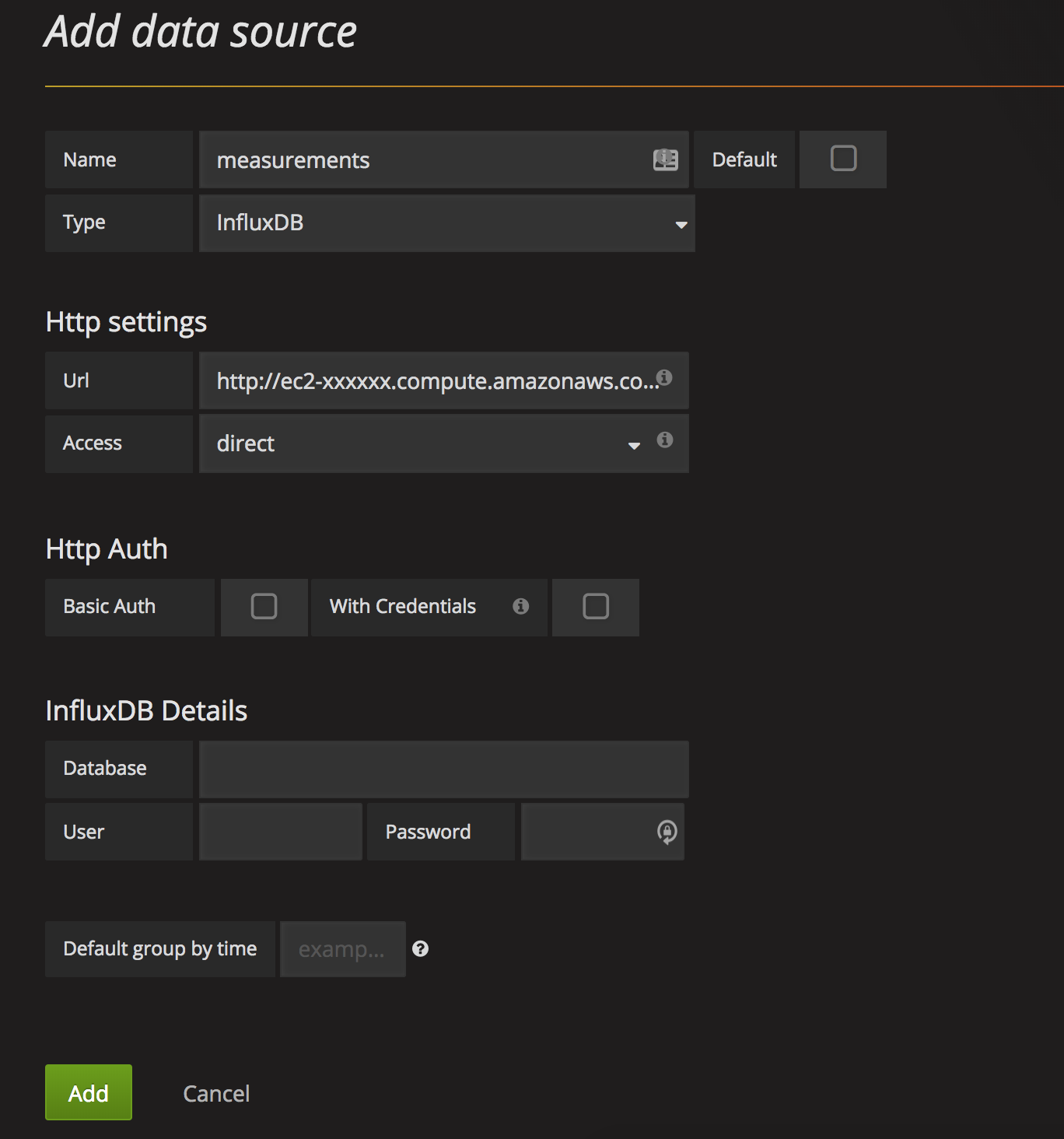
Hopefully you configured authentication for your InfluxDB installation (as suggested before) if you’re planning to put it to production use. In this case, fill in the credentials into InfluxDB Details section.
Let’s plot!
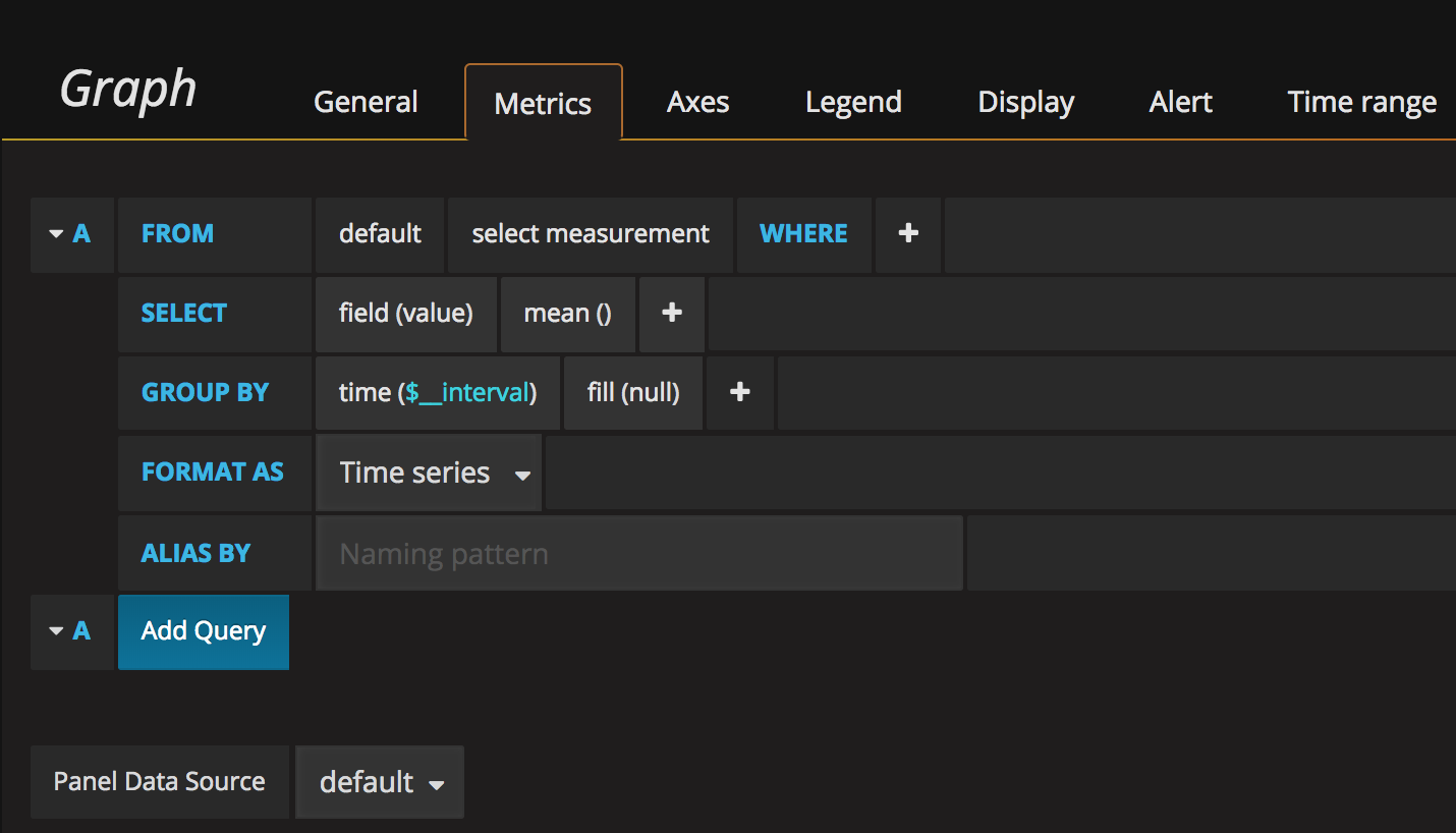
We’re now ready to draw graphs. You can create a dashboard (Dashboards -> New) and a first graph (Graph). A click on a “Panel Title” and Edit should show something similar to this:
I’ll now plot graphs using data from Airly air quality sensors.
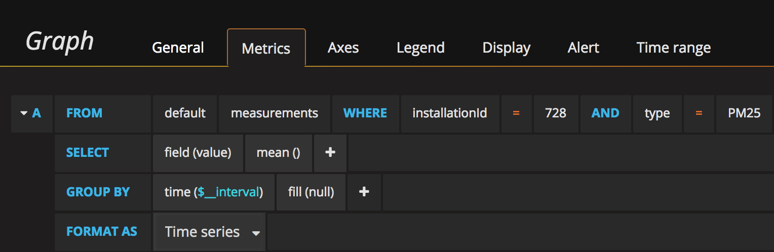
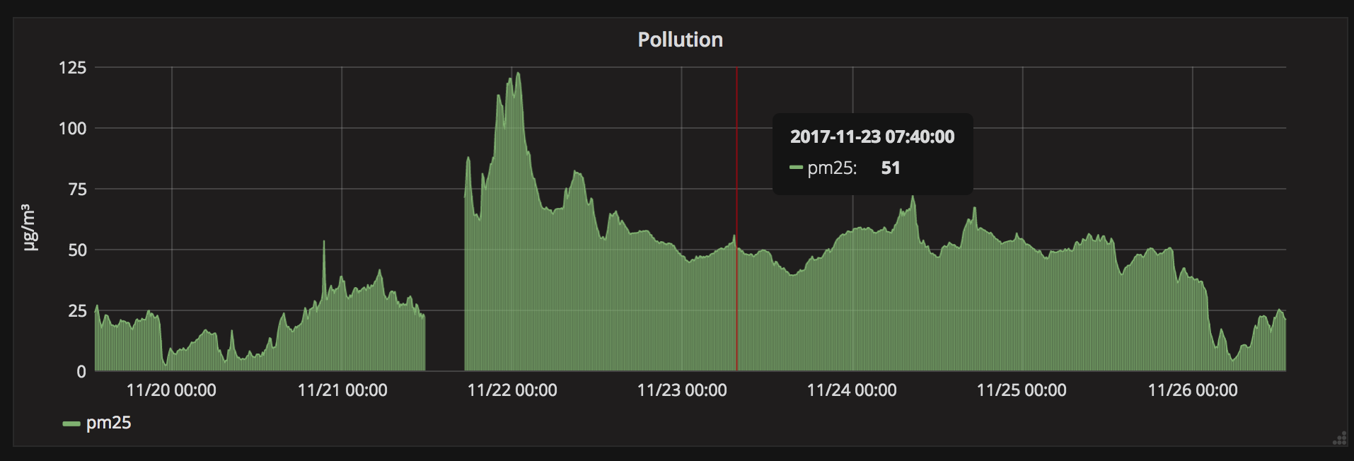
First, average PM25 pollutant levels for sensor 728:
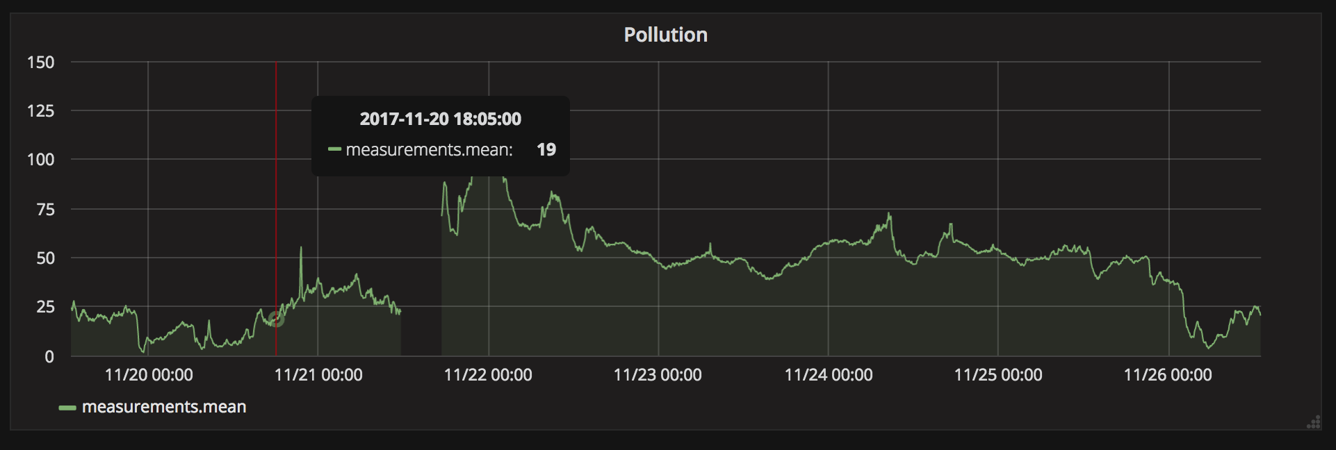
Resulting graph:
A few cosmetic changes:
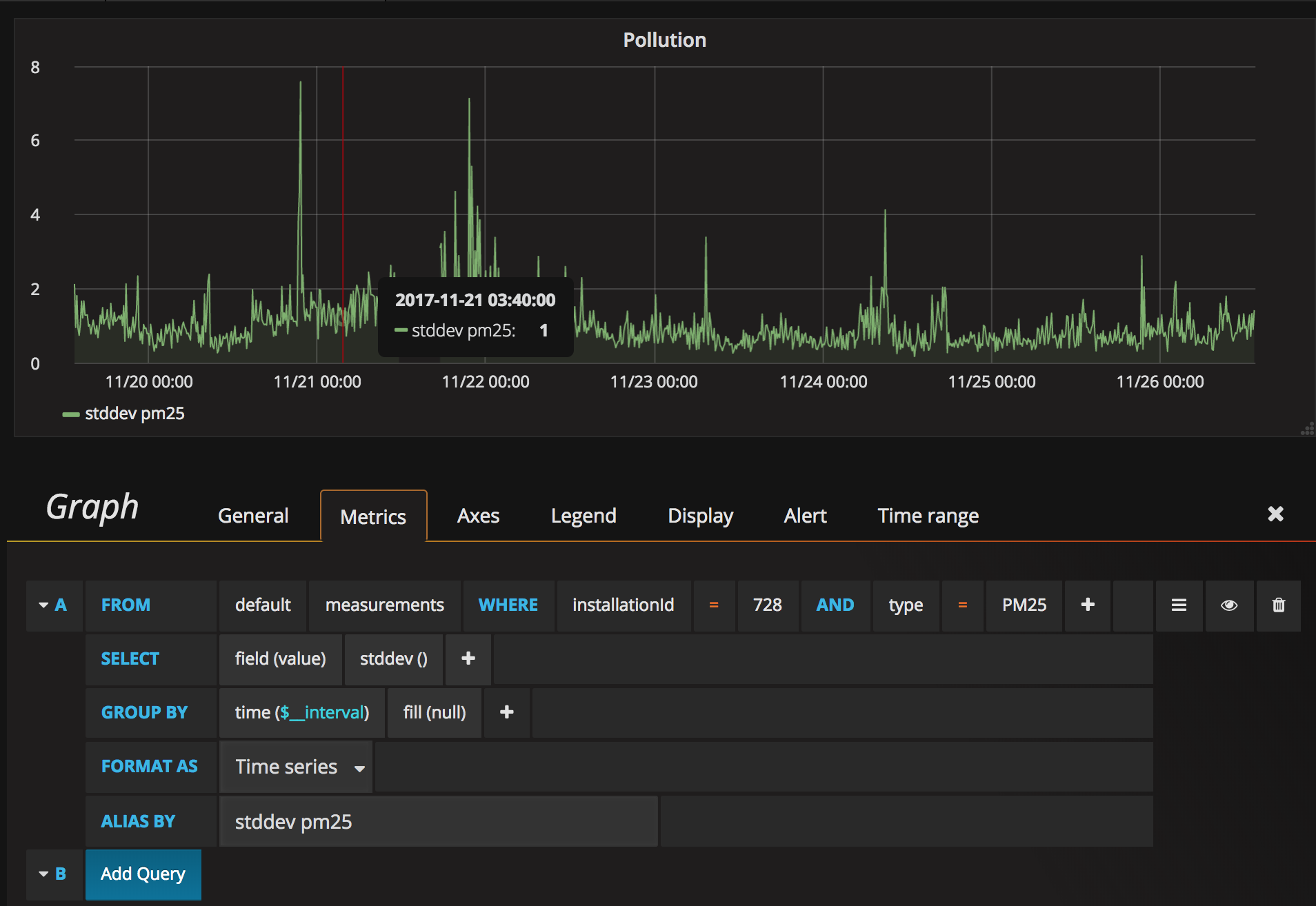
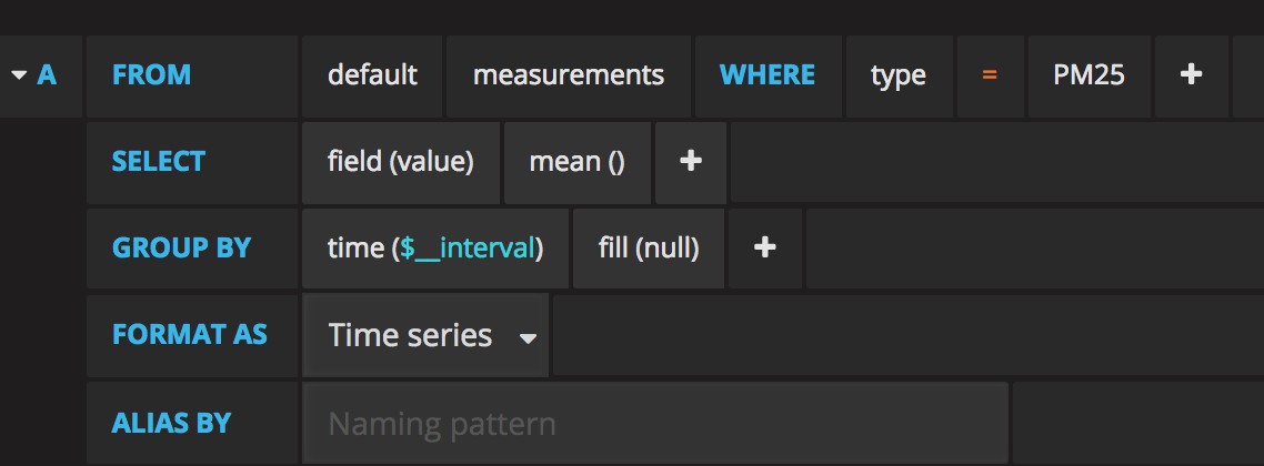
Let’s now plot a standard deviation for those measurements:
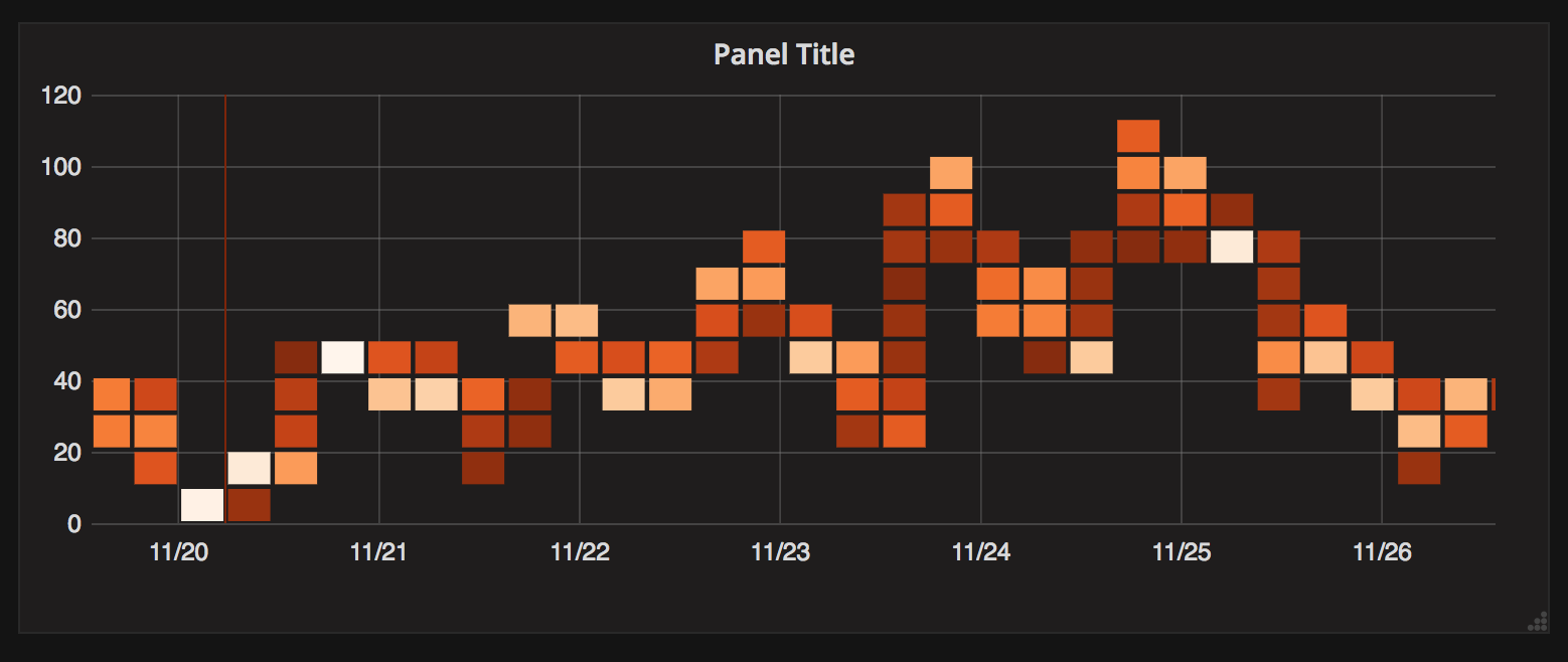
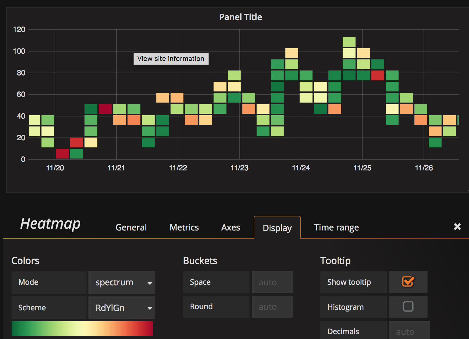
Let’s now draw a heatmap (Add Panel -> Heatmap).
 This will draw a heatmap of PM25 values for all sensors. The values are grouped into buckets grouped by value (PM25 pollutant in this case), and the color is the number of occurrences of those values in a given timeslot. The higher and more red the boxes are, the worse air Poland breathed at that time.
Let’s change the colors to classic Red-Yellow-Green
Results
We quickly installed Grafana, connected it to InfluxDB data and started plotting beautiful graphs. Do check out Grafana, if you haven’t yet. It’s a powerful tool that is fairly simple to understand and start using.